A complete guide to crafting high-converting CTAs
Unlock the Power of Persuasion: Insider Secrets and Real-Life Examples to Turn Your CTAs into Conversion Machines
Are your website visitors leaving without taking any action?
I feel your pain. You've invested time and resources into creating a website that looks great and is packed with valuable content, yet your visitors simply leave without a trace.
Watching potential customers slip away feels like chasing a greased pig, leaving you with flat conversion rates and snail-paced business growth.
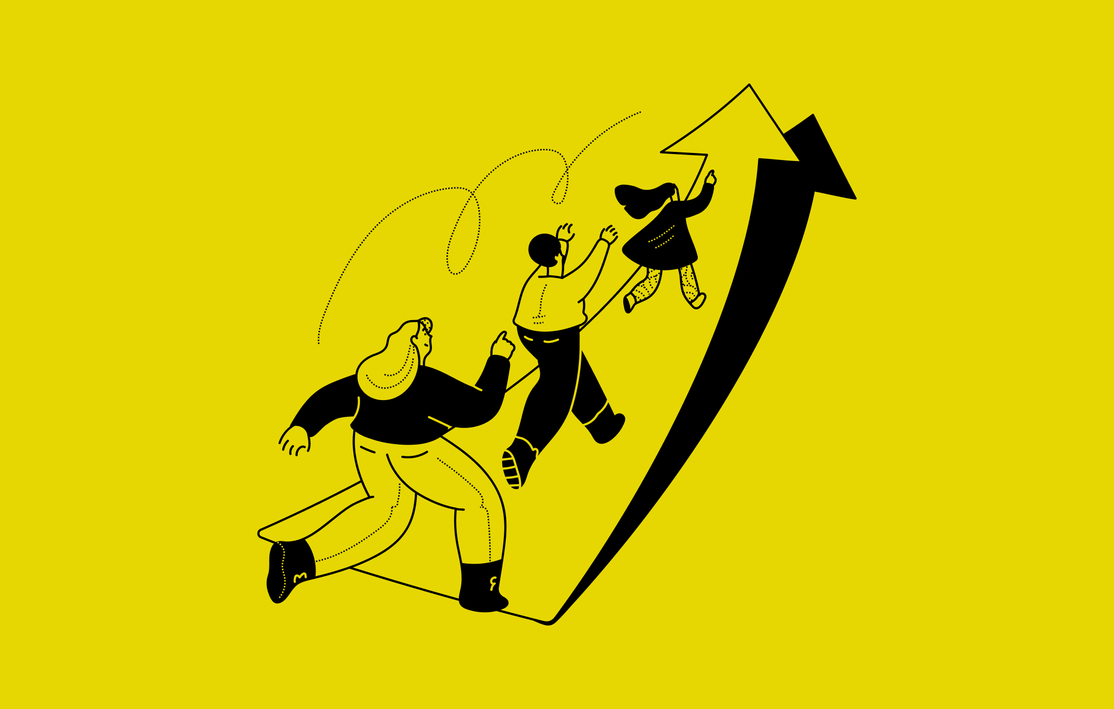
The solution? Craft powerful and persuasive calls to action (CTAs) that will catapult your website’s success.
In this blog I’m sharing proven strategies and examples for creating CTAs that convert.
You'll discover how to turn your website into a high-performing conversion machine that propels your business to new heights.
So, buckle up and let's dive into the world of effective CTAs!
Unlock the power of CTAs
What they are, why they matter and how they drive results
A call to action, or CTA for short, is like a friendly nudge or invitation that encourages your website visitors to do something specific. They serve as a bridge between your website and your desired outcomes.
A website without a clear call to action is like a rudderless ship – it may look impressive but won't help you reach your destination. They mean the difference between a visitor merely browsing your site and becoming a loyal customer.
CTAs come in various forms to cater to different marketing campaigns and audiences.
Some common types of call-to-actions include:
Buttons: The most widely used CTA type, buttons feature actionable phrases that prompt users to click and engage further.
Forms: These CTAs convert visitors into leads by offering something in exchange for contact information. Offers can range from downloadable content and product quotes to service sign-ups and subscriptions.
Banners: Positioned at the top, bottom, or side of a webpage, CTA banners typically display eye-catching copy and design that encourages users to take action.
Contextual Links: Often found within blog post body copy, these clickable text links direct users to related landing pages.
Pop-Ups: These small windows suddenly appear on a page, drawing users' attention to offers or sign-up opportunities. The best method for pop ups - Exit intent pop-ups, trigger when users are about to leave the site.
Slide-Ins: Similar to pop-ups, slide-in CTAs capture users' attention by appearing from the bottom or sidebar. These CTAs are less disruptive to the user experience compared to pop-ups.
Looking for CTA examples? Please keep reading
How to craft CTAs that entice and engage
Now that you've grasped the significance of CTAs and the various kinds let's delve into the methods and approaches to crafting them.
Determine your goals and sell the dream outcome.
To start, it's crucial to determine where you want them to go on their journey through the website and understand the visitor's problem and their dream outcome.
What do they want to achieve?
Doing this gives you a clear direction on what message to convey and how to structure your content.
You want visitors to feel like you understand their needs and can offer them a solution that's impossible for them to ignore.
Once you know this, you'll be able to craft engaging copy that speaks directly to them and offers them the value they're looking for.
Believe me, this will elevate your website's performance from good to great!
Here's an example of a CTA that locks into the idea of selling the dream outcome:
“Transform Your Health Today: Grab our free Ultimate Wellness Guide and kickstart your path to a happier, healthier life!"
Fact💡: Selling the dream outcome instead of generic sign-up phrases can increase conversions by more than 15%.
Make your CTAs specific and sell the value
Instead of using 'Buy Now' or 'Sign up' use 'Get instant access & lifetime updates'.
You should do this because it gives the visitor a better idea of what they're signing up for and what they'll achieve rather than what they have to do.
Also, instead of using ‘Submit’, use phrases like “Yes, I'm ready!” or “Get my free report now”.
These phrases are much more direct and specific and will encourage visitors to take action.
Make your CTAs feel effortless
When it comes to taking action, people often lack the time and energy to invest in something that will require significant effort.
It's crucial to make your call-to-actions (CTAs) appear effortless so people feel motivated to take the next step with enthusiasm and ease.
For instance phrases like "Begin my complimentary trial" or “Download immediately” make it sound easier for the visitor to take action so will be more willing to do so.
Leverage the power of numbers
People are often drawn to numbers because they provide a sense of tangibility and specificity.
Use numbers in your CTAs to make them more enticing.
For example, "Join over 5,000 satisfied customers" or "Get instant access to 100+ expert tips."
Create a sense of exclusivity
Making your offer feel exclusive or limited can create a sense of urgency and make visitors more likely to act.
Use phrases like "Limited spots available," "Exclusive access," or "Members-only content" to give your CTAs an air of exclusivity.
Offer added bonuses
Sweeten the deal by including a time-sensitive bonus or an exclusive perk when visitors take action.
This extra incentive encourages them to act quickly and adds value to your main offering.
For example, "Sign up for our course today and receive a bonus module worth $99, absolutely free!"
Incorporate social proof
Social proof, such as testimonials or endorsements from other users or industry experts, can boost the credibility of your offer and make your CTAs more persuasive.
Incorporate phrases like "As seen on [Media Outlet]" or "Recommended by [Influencer Name]" in your CTAs to build trust and encourage action.

WhiteWall.com excels in leveraging the perspectives of globally acclaimed photographers and designers to captivate visitors and encourage them to explore further.
Use personalization
Personalising your CTAs can help create a stronger connection with your audience and make your offer more appealing.
If you have information about your website visitors, such as their names, locations, or interests, consider incorporating that information into your CTAs.
For example, "Sarah, unlock your personalized meal plan today!" or "Discover the best hiking trails near [Visitor's City]."
Add a touch of curiosity
Sparking curiosity in your audience can encourage them to take action. Craft your CTAs in a way that leaves them wanting more information or hints at something intriguing.
For example, "Uncover the secret to doubling your productivity" or "Find out what's behind Door #3."
Utilise FOMO (Fear of Missing Out)
Tapping into your audience's fear of missing out on a great opportunity can help drive them to act.
Use language that emphasizes limited-time offers or availability, such as "Don't miss out on this amazing deal" or "Last chance to join before the doors close."
This can create a sense of urgency and encourage visitors.
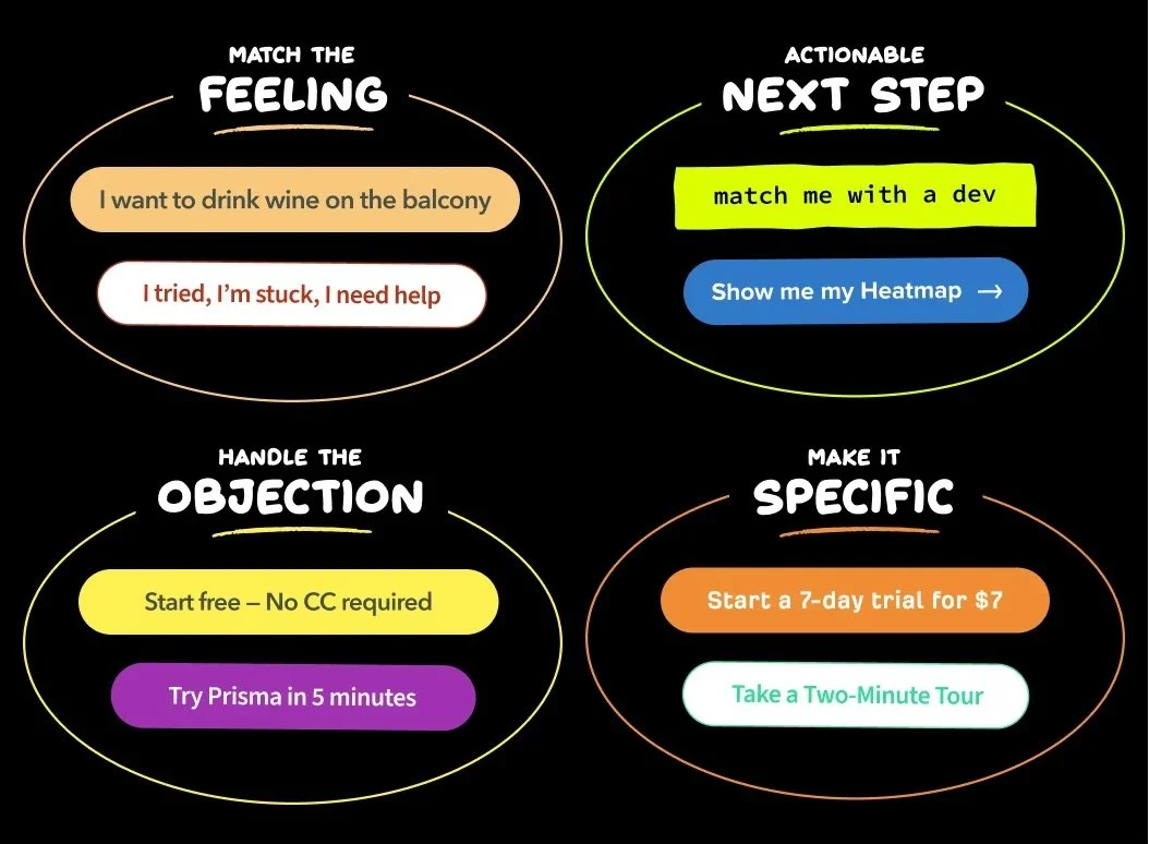
Match the feeling or handle the objection
A fantastic resource from MarketingExamples.com showcases four distinct writing styles for crafting CTA buttons, designed to address different aspects of the user experience, including:
Match the Feeling: Align the tone and language of your CTA with the emotions your audience is likely experiencing. By empathizing with your visitors, you can create a sense of connection and make your CTA more appealing.
Handle the Objection: Address any potential concerns or objections your visitors may have upfront. By doing so, you can alleviate their doubts and hesitations, making them more likely to take the desired action.
Tips for designing persuasive CTAs
When designing your call-to-actions, it's essential to not only focus on the message but also on the visual elements that help them stand out and grab your visitors' attention. Here are some expert tips for crafting visually appealing CTAs:
Embrace Contrasting Colors
Utilize colours that contrast with the rest of your website to make your CTA buttons truly pop. This will help them stand out and draw your visitors' attention, making it more likely that they'll take the desired action.
Prioritise Prominent Placement
Position your CTA in a highly visible and easily accessible location on your website. This ensures that your visitors won't have to hunt for it, and it'll be readily available when they're ready to take action.
Leverage Visual Cues
Incorporate arrows, icons, or other visual elements to guide your visitors' attention towards your CTA. These visual cues can subtly encourage visitors to interact with your call-to-action and boost the likelihood of them clicking on it.

Keep It Simple and Clear
Avoid cluttering your CTA with too many design elements. Maintain a clean and straightforward appearance, ensuring that the message remains the focal point and doesn't get lost in an overly complicated design.
Optimise for Mobile Devices
With more users accessing websites through their mobile devices, it's crucial to design your CTAs with mobile responsiveness in mind. Ensure that your call-to-actions look just as appealing and are easy to interact with on smaller screens.
Avoid these common mistakes when crafting your call to action
Here are some common mistakes to avoid when writing a call to action:
Avoid Vague Phrasing: Instead of using generic phrases like "Learn more" or "Free Discount," be specific and highlight the value, such as "Get 20% off today."
Skip Negative Language: Refrain from using words like "but" that can cast a negative light on your offer. Instead of saying, "Order now and receive a free trial, but you pay for shipping," try "Only pay to ship and try Free for 30 days."
Focus on the Outcome: Lead with the benefit your visitor will receive, rather than the CTA itself. Instead of "Join my newsletter and get 1 free hour of writing advice," use "Get 1 free hour of writing advice if you join my newsletter."
Simplify Your Request: Don't ask your visitor to do multiple things in a single CTA. Stick to one clear action, such as "Sign up" or "Follow me," rather than trying to combine several requests.
Don't Be Overly Aggressive: Avoid pushy language like "Buy now or regret it forever." Instead, use persuasive but respectful phrasing that encourages action without alienating your visitors.
Limit Jargon and Acronyms: While you might be familiar with industry-specific terms and acronyms, your target audience may not be. Keep your language accessible and easy to understand for everyone.
Make Your CTA Visible: Don't hide your call-to-action in a hard-to-find location on your website. Ensure it is prominently displayed and easily accessible to maximize its effectiveness.
Keep it short and sweet: Lengthy CTAs can overwhelm your visitors and cause them to lose interest. Keep your call-to-action copy short, concise, and focused on the key benefits or value your visitors will receive.
Avoid Overpromising: Strike a balance between enticing your audience and maintaining honesty. Refrain from exaggerating or overpromising the dream outcome; instead, focus on providing a realistic and achievable result that still captures your visitors' interest.
I need to give a big thanks to Ryan Musselman for some of these copywriting tips. You should follow him if you want to learn how to write great CTA copy, he’s also a bit of a Linkedin Master.
Are you investing £££ in SEO every month but you’re CTA’s aren’t converting?
Let me take care of them for you.
Learn from the pros
How top brands create compelling CTAs (with examples)
Discover how top brands craft irresistible calls to action that reel in customers and drive conversions. Let these prime examples inspire your own CTA masterpieces and elevate your website to new heights.

The Uber home page CTA
Uber: Sign up to drive CTA
CTA Uber skillfully employs multiple tactics in their CTA. The headline, "Get in the driver's seat and get paid," directly addresses frequent drivers and dangles the enticing prospect of earning money doing what they already love.
The concise description, "Drive on the platform with the largest network of active passengers," adds a dash of social proof and credibility to the mix.
A relatable image of a driver humanises the CTA, making it more approachable.
Lastly, the "Sign up to drive" button is refreshingly specific, implying a hassle-free signup process that will encourage potential drivers to click without hesitation.

Sky Mobile: Hello Possible CTA
Sky Mobile masterfully leverages accolades, enticing bonuses, and an air of simplicity to coax potential customers into switching from their current providers.
They emphasize the ease of transitioning to their service while also dangling the appealing prospect of joining an "award-winning network."
Additionally, they sweeten the deal by offering a generous data rollover policy that spans three years, making it all the more tempting for users to make the leap.

Hubspot: Grow Better CTA
Hubspot strategically positions its CTA just beneath a panel that boasts an impressive clientele: over 167,000 customers across 120 countries. This clever use of numbers and social proof lends credibility to their brand.
Additionally, they enhance their appeal by offering free tools and employing inviting phrases like "Start free." The catchy slogan "Grow Better" encapsulates the dream outcome, while the copy further emphasizes the simplicity of embarking on this journey with them.

Tim Ferris: Newsletter CTA
Tim Ferriss expertly employs the power of exclusivity to entice people to join his widely popular newsletter.
With phrases like "Get Access" on the button and "exclusive email" in the brief description above the sign-up field, he creates a sense of urgency and desirability.
The presence of Tim's image on the page adds a personal touch, while the headline mentioning "5 things I've been loving" further intrigues the reader.
The sign-up process is streamlined with just one email field, and the anticipation of receiving valuable insights from this renowned individual, famous for uncovering hidden gems, amplifies the appeal.

ClickUp - Free Forever CTA
ClickUp skillfully addresses potential objections by featuring messages such as "Free Training," "Highest Levels of Uptime," and "Serious about Security" right below their CTA. The main button also showcases "Free Forever," making the offer feel irresistible and risk-free.
The striking headline, "One app to replace them all," captures the dream outcome, appealing to those eager to simplify their work processes and consolidate everything under a single, efficient platform.

BeeHiiv savings CTA
Beehiiv - Savings tool CTA
Beehiiv, a newsletter tool, presents a captivating and unconventional CTA panel. They've cleverly integrated an interactive tool that enables potential customers to calculate their annual savings by switching providers.
By pinpointing their customers' pain points, Beehiiv recognizes the significance of cost savings, especially in a competitive market where features are similar, and price becomes a crucial differentiator.
The messaging, such as "Unlock more earnings," is entirely focused on helping customers save money. The button CTA, "Make the switch," offers a clear and actionable next step for those eager to reap the benefits.
Conclusion
With expert tips and proven techniques at your disposal, it's time to create CTAs that take your business to new heights. Remember to keep your call to action clear, concise, and compelling, and continuously test, refine, and optimize for maximum impact. A successful CTA can be the difference between a visually appealing website and one that drives genuine business growth.
Stay informed about the latest trends and best practices in digital marketing as you refine your CTAs. This knowledge will help you identify new strategies and tactics for your CTA design and copy, ensuring your approach remains fresh and effective.

