4 costly mistakes that are killing your website sales
Struggling to get your website to perform at its best? Don't worry - for this blog I'll highlight the 4 common website design fails that can easily trip up business owners and harm sales - and how to avoid them!

Making sure your website is designed correctly is essential to creating an effective and engaging experience for your users
“Your website is usually your customer's first interaction with your brand, and first impressions count.”
Unfortunately, I have seen many businesses over the years make the same mistakes time and time again.
Below are the 4 common website design mistakes you must look for and avoid.
Mistake No.1
Website isn't 'properly' optimised for mobile
As a user, it can be as frustrating as hell when a website isn't optimised for mobile, especially if you're not at home.
Or on a motorhome holiday in North Wales with your family, and you've lost your keys in the Irish sea... yeah... I've been there and done that!
In desperate situations like this, your first point of call is your mobile phone. They really are good for getting yourself out of a little pickle.
The last thing anyone needs from a mobile website when you're in a frantic frame of mind is:
Slow loading times
Long pages of boring copy
Text and images that are too small to read or see clearly
Menus and buttons that are difficult to click or touch
Unplayable videos and audio
Pop-ups that are difficult to close
Not responsive to screen size
Forms that don't work
Unhelpful error messages
Making sure your website looks and works great on mobile devices is essential in today’s fast-paced world.
🧐 Fact : Mobile internet traffic accounts for almost 60 per cent of total web traffic.

Yet, a lot of organisations fail massively when it comes to optimising their websites for mobile.
Yes, most business owners already understand they need a 'responsive' website (one that responds to different screen widths) and have probably paid to have one, but I see a lot of responsive websites that have been built poorly.
“Avoid the trap of presuming your website works well on mobile.”
How can you tell if your website is poor for mobile devices?
The best advice I can give and the first thing you need to do, is find the problems to be able to fix them. That means testing the hell out of it!
Test on a variety of mobile devices and operating systems.
Get feedback from your users regarding their experience on mobile. Discover where and how are they struggling.
Test it in different scenarios and locations. Like the beach where service might be slow.
Test it in multiple mobile browsers including Safari, Chrome and Firefox.
Heavily test all of its functions and features and look for errors.
Test the user journey and look for any forms of friction or barriers along the way.
Taking the time to test your website before launch and regularly after can save you from a lot of headaches in the long run.
A few simple tests can make the difference between a successful website and one that leaves your customers frustrated and unsatisfied.
🥳 Bonus tip! - Start by reviewing your website via the Google Search Console.
Mistake No.2
Zero engagement because of cluttered and bloated content
Excessive amounts of content and choices on a web page can cause information overload (or cognitive overload) within people.
This impedes a person’s decision making process, sometimes resulting in no decision being made at all.
Your website should be helping people decide which of your product or service is right for them, it definitely shouldn’t be confusing them.
Thankfully there are some easy remedies to prevent cognitive overload.
Make copy easy to read
When writing, it is important to ensure the copy is broken up into manageable chunks so text is easier to read.
Avoid using long paragraphs of copy as they are overwhelming for the reader.
Use lots of line breaks and avoid the use of commas instead use full stops. Like I'm trying to do with this newsletter.
💡 Pro Tip - use a max width of 700 pixels for the body copy. Paragraphs of copy become difficult to read when they take up the full width of a large screen, especially when the font is small.

The content on the left is difficult to read. Using white space and more line breaks makes the content easier to consume.
Whitespace is your friend
White space, also known as negative space, is the unoccupied area of a website. Such as between text, images, margins, and around the edges of the page.
Lack of white space can make it difficult for visitors to focus, making it harder for them to comprehend and retain the information presented on the website.
It’s important to give your content space to breath as it helps to create a sense of balance and hierarchy within a design, it makes it easier for users to understand the structure of the site and it can be used to create visual interest and emphasis.
Additionally, it can also help to create a sense of professionalism and elegance, making a website appear more polished and sophisticated.
Cut down on content
Cutting down bloated website content from time to time is good practice. Here are a few methods for how to do it:
Remember the purpose of the website and what message it is trying to convey. This will help to determine what content is essential and what can be removed.
Use Google Analytics to determine which pages and content are getting the most engagement. Consider removing content that no one reads.
Remove any content that is repetitive or duplicated, as it adds no value to the website.
Use videos to supplement text and convey information more efficiently.
Get feedback from users and see what they think of your website, what they find useful and what they don't.
It's important to remember that cutting down on website content is not just about removing content, but also about making it more effective and user-friendly.
It's also important to keep in mind that the process of cutting down content should be an ongoing process and not a one-time thing.
Mistake No.3
Annoying customers with confusing navigation
A lot of business websites are built on CMS’s (content management systems) like WordPress, which allows for new pages and content to be added easily.
CMS driven website’s are extremely useful for keeping a website fresh and informative, however, overtime they can often become a bit of a mess, with pages and content being added in all sorts of places.
This leads to website navigation being difficult to use and visitors not taking action because they’re frustrated.
How to avoid confusing website navigation
Your website is the gateway to your business - make sure it's organised in a way that's intuitive and straightforward, so users can effortlessly access the information they need.
This will result in increased website engagement and a better user experience.
Ensure:
Content and pages are logically grouped together.
Clear, concise language and labelling are used throughout the website. Don't use jargon or terms that have no meaning to your clients.
Mega menus or menu tabs are easy to locate and user-friendly.
Listing pages with lots of options or products (e.g. blogs or e-commerce stores) can be quickly and easily navigated with dynamic filtering and sorting capabilities.
A dynamic search function with an autocomplete feature is available to users. This is especially useful for websites with lots of content. Note: There's no need for a search function if your website only has a handful of pages, this can actually be a hindrance rather than help.
💡 Pro tip: Definitely use a "burger menu" navigation (three horizontal lines) for mobile devices to save space and make the navigation more compact, however, don't use it on larger screens unless you add a 'Menu' label next to the icon, as this will give clarity to non-techie users.

Try not to use burger menus on larger screens
Mistake No.4
Not having clear call-to-actions
Having a clear call to action on your website is one of the most important elements of effective design and it’s the most common mistake businesses make.
Without one, visitors won't know what to do next and will become confused and leave without taking any action.
How to create effective call-to-actions
I have a created a guide for crafting highly effective call-to-actions, for now, here are a handful of the best practices for effective call-to-actions (CTAs):
CTAs should be designed to stand out visually on the page. Use contrasting colours, clear typography and an enticing message.
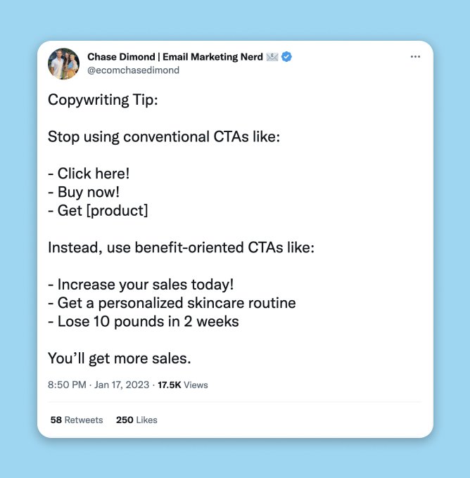
Use action or benefit-oriented language such as "Start your free trial" or "Get your discount now" to encourage visitors to take action.
Creating a sense of urgency or scarcity motivates visitors to take action. For example, "Limited time offer" or "Only a few spots left" can encourage visitors to act quickly.
Using social proof, such as customer testimonials or displaying the number of subscribers who have signed up, can increase the perceived value of the call to action.
Highlighting clear and specific benefits of taking the desired action can increase the perceived value of the CTA too.
Using humour, video and storytelling in the CTA can make it more memorable and engaging and increase the chances of it being clicked.
💡 Pro Tip - Test and experiment with different variations of CTAs and measure their performance to discover what works best for your audience.
Here's a Tweet from Chase Dimond, who knows a thing or two about writing great copy for a call to action.
Conclusion
There are many common website design mistakes that business make which can have a negative effect on their customers and their overall success.
With a little bit of thought, planning and time, you can easily prevent these mistakes and boost your sales and increase leads immensely!

